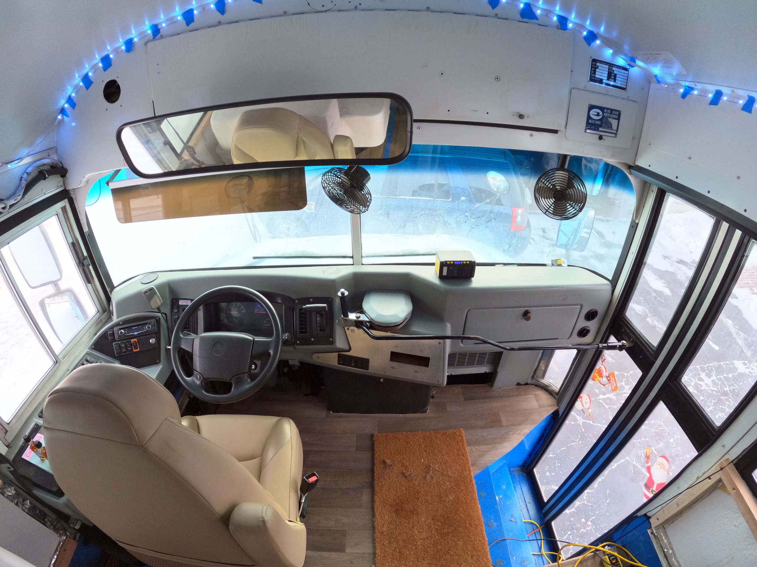
Skoolie Layout Tour and Conversion Plans
We have been physically converting our bus since May 2021, BUT we have been planning layout of our tiny home since the beginning of 2021. The wants, needs, and layout iterations have evolved fluidly over time, but by golly, I think we’ve finally got it.
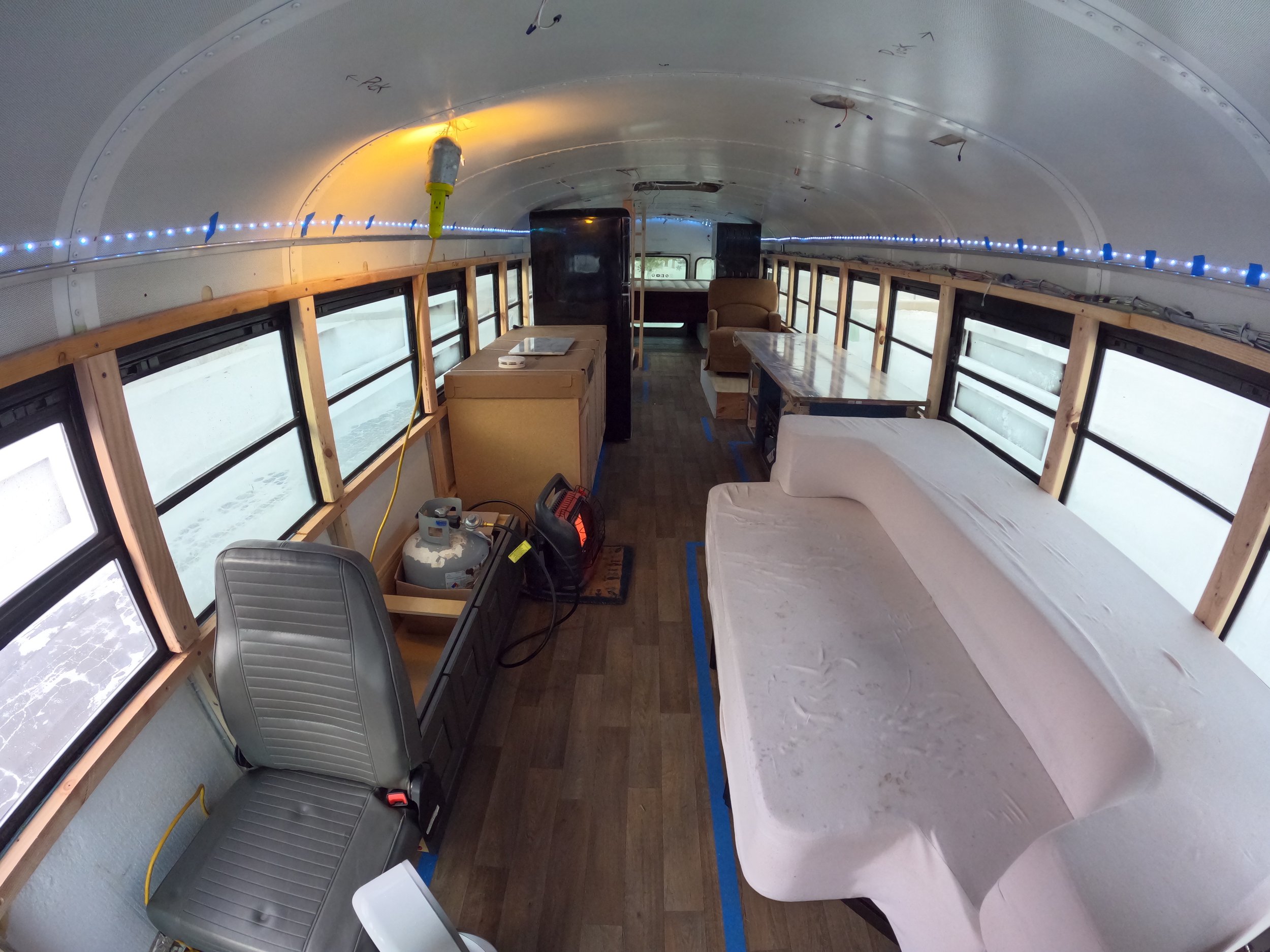
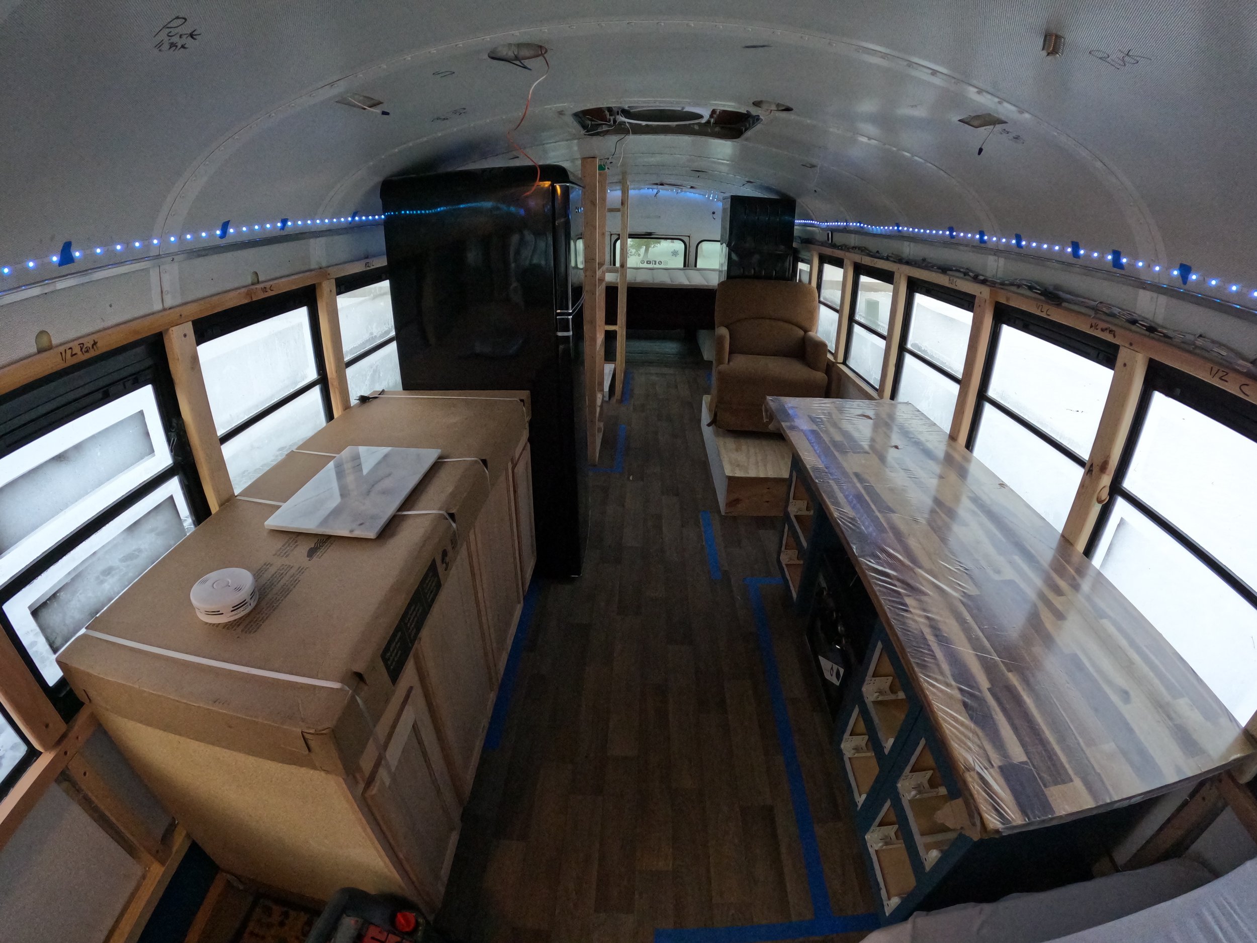
When we first began planning our layout we were super committed to the L-shaped layout with a walkway on the side. We loved this layout because it separates the back ‘bedroom’ area from the front living space area and generally we just really liked the flow of it. Nearly every bus tour that we swooned over was an L shape layout. Sadly, after getting into our space and mapping things out, the L shape layout simply wasn’t an option for us, mostly because we weren’t willing to do a roof raise and we wanted Ben to be able to stand up while walking around our home. In order to achieve that we had to prioritize having a walkway in the highest part of the bus, which is the middle.
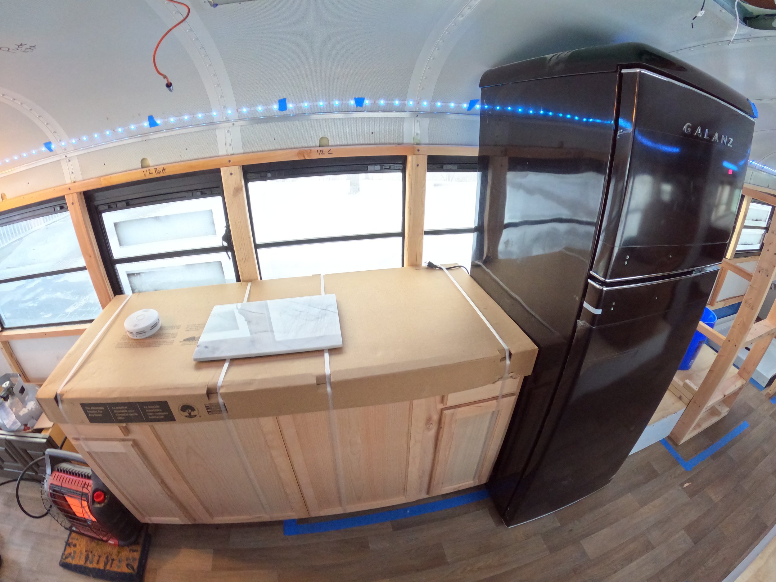
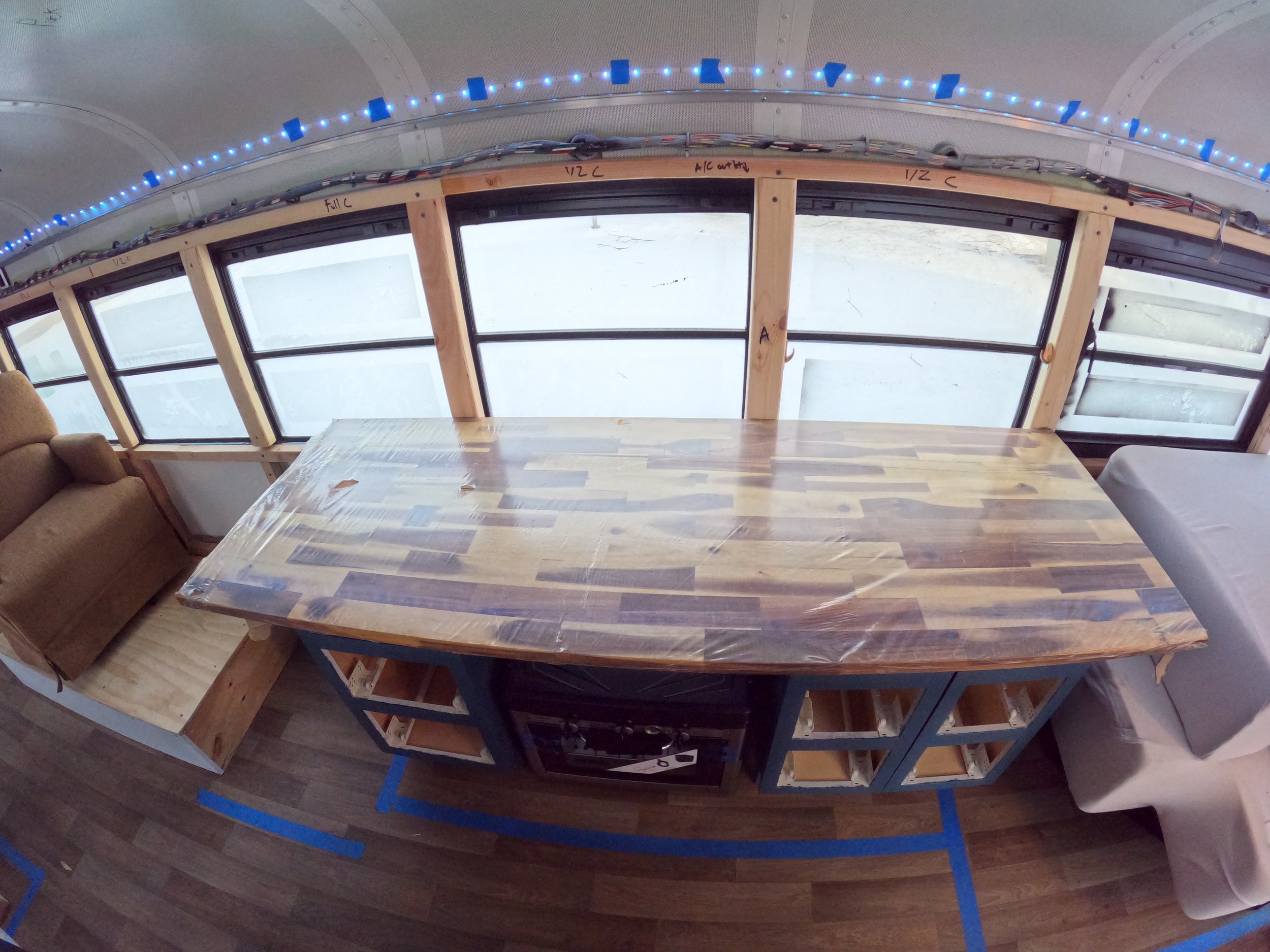
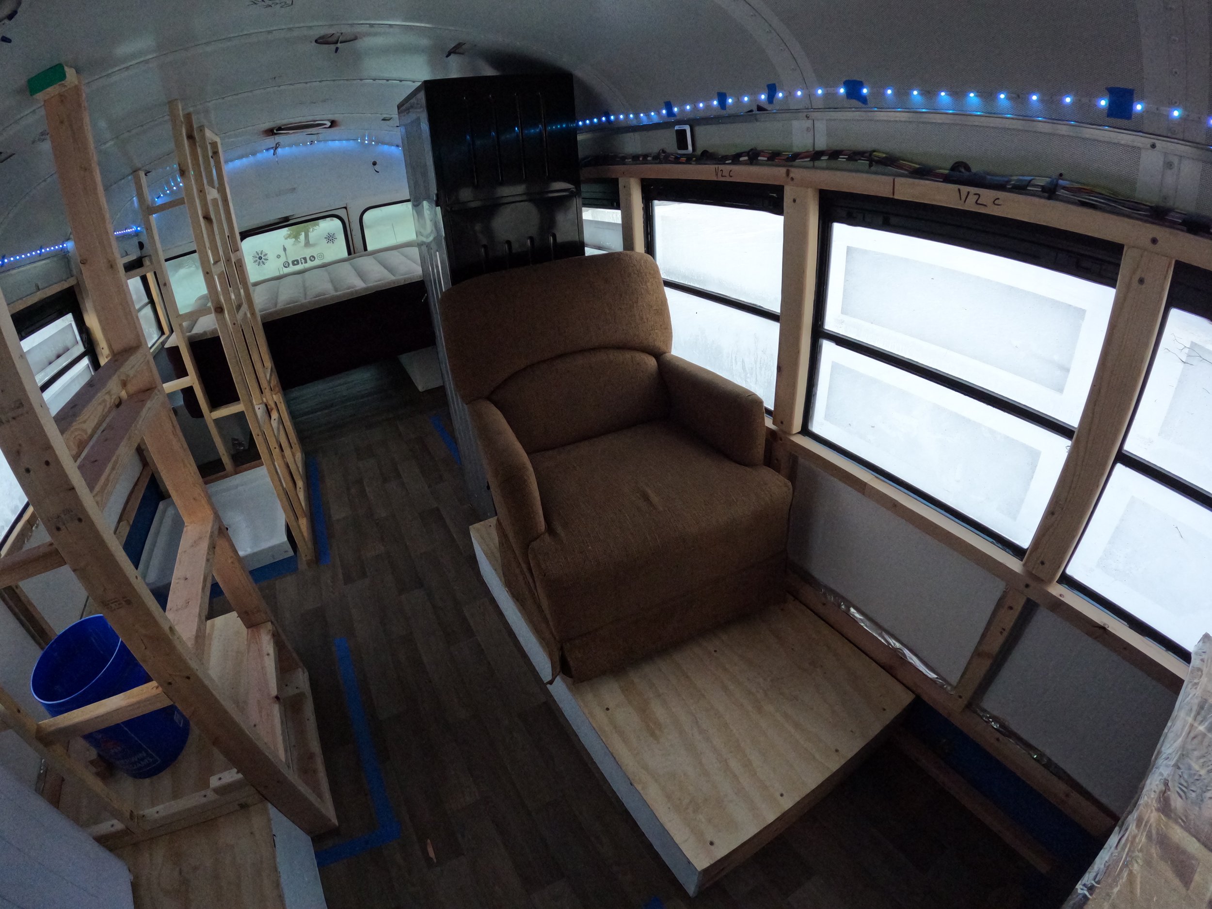
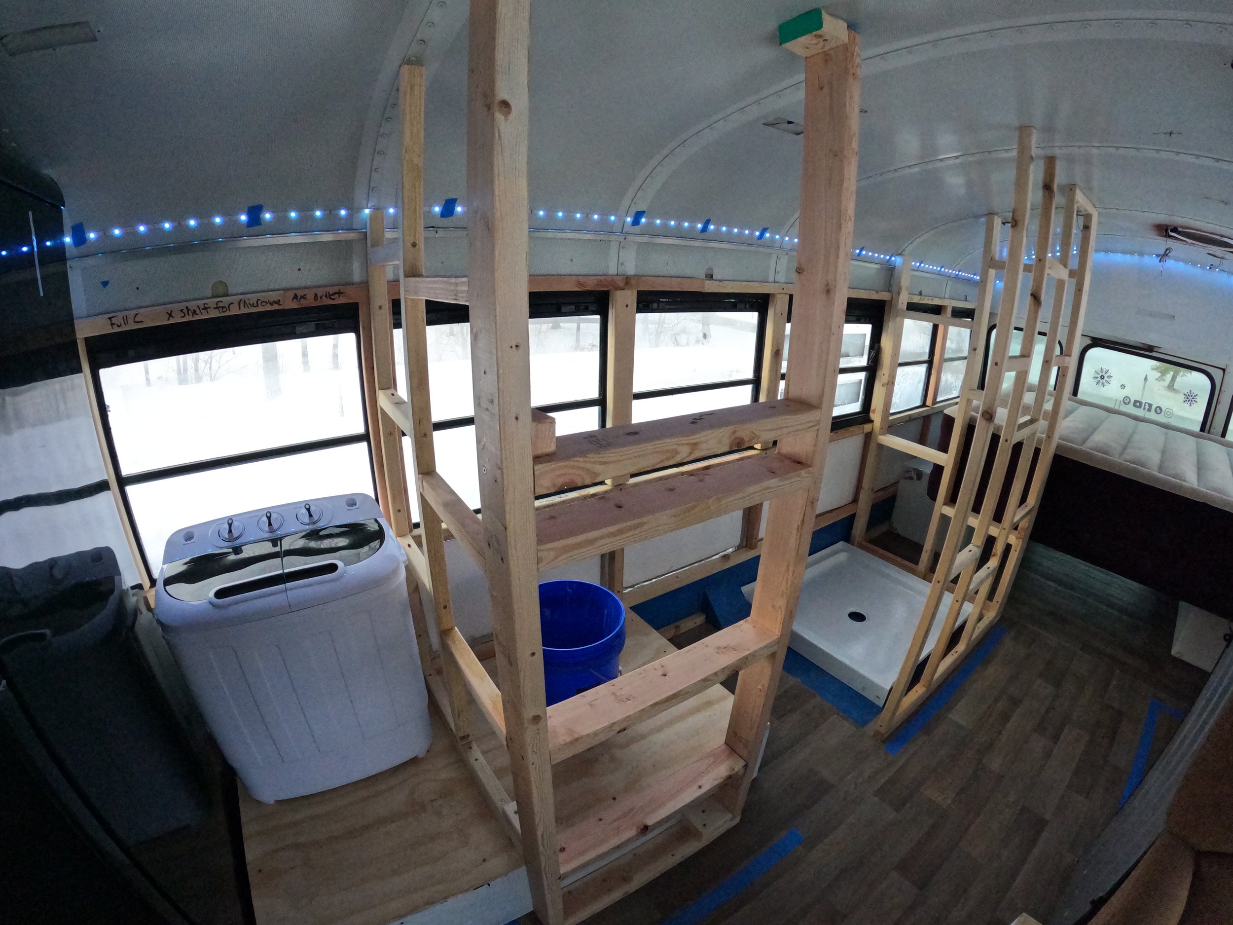
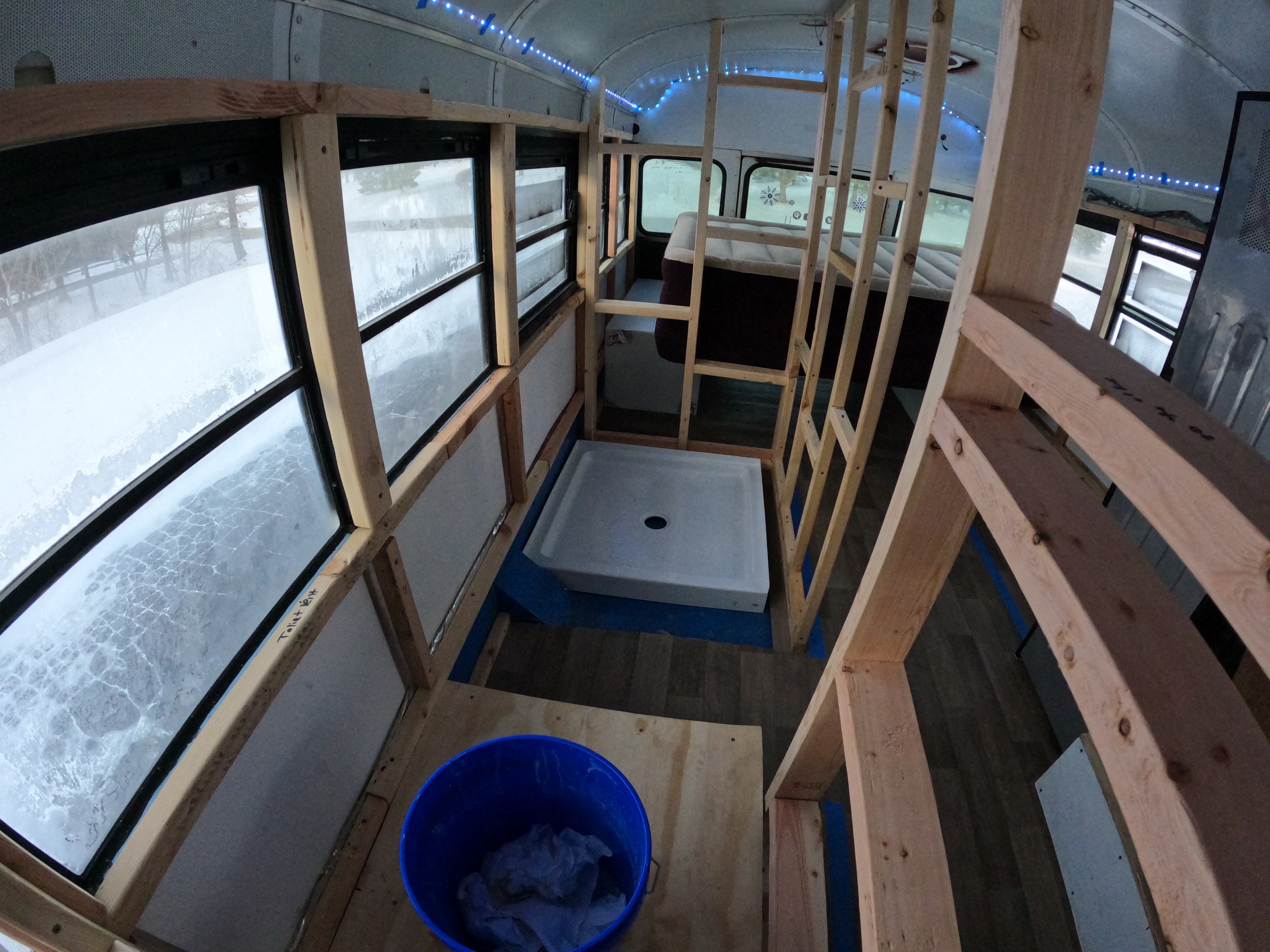
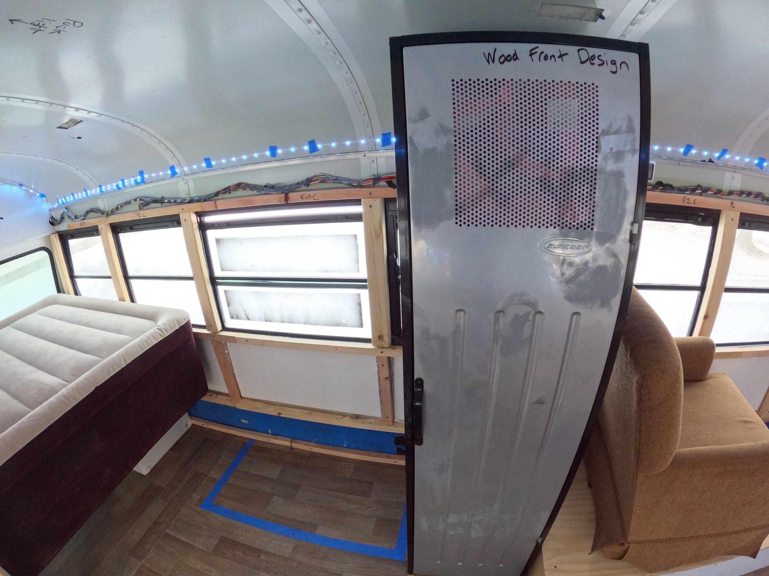
Once that decision was made other things began to fall into place. We knew that we wanted a spacious bathroom and kitchen as well as a comfortable living room area. Since we have a 40 footer and it’s just us and our pup Ragnar, we have a lot more room to play with the design than those with larger families. Because we do have what some may consider excess space, we have been able to include some amenities that you would find in any standard house. Our fridge, couch, bed, recliner, bathroom, and sink are all on the larger side, especially when it comes to tiny homes. To counterbalance the larger pieces in our design, we have tried to keep as many windows in place as possible and have opted out of most upper-level cabinetry.
The video above does a much job explaining our design plans than I will be able to in writing. But generally, we are shooting to create a warm bourbon lounge-type feel. Think dark colors, leather, layered textures, with some exciting pops of art. Much of the bottom half of the build will be decorated in darker colors so that we don’t have to clean 24/7, 7 days a week, while the ceiling will be clad in white art deco ceiling panels. When it comes to lighting we have decided to go with a mix of puck lights and dimmable silicone runners along the side walls.
We are doing our absolute best to minimize waste in our build and whenever possible to buy second hand. Roughly 80% of our build has been sourced from Facebook Marketplace, overstock warehouses, Habitat Restores, or things we already owned.
If you are currently chest-deep in planning your layout and you feel like beating your head against the wall, I simply encourage you to take your time. Tape out your layout once your subfloor is in and then spend some time in the space to really get a feel for it. If possible throw your mattress and whatever else you’re planning to include inside and sleep in it for a week or so. This is the absolute best way to finalize your layout.
As always, if you want someone to chat with about it, feel free to leave a message below, or on the Youtube video above.
